
“Data visualization” and “infographic” have been buzzwords in the design realm for the last decade. These days it’s hard to browse through a statistic-laden article on a website or magazine without coming across a glossy graphic, complete with charts and flashy illustrations, that make the 400 words next to it obsolete. Readers get all the information they need at first glance from the visualization.
Corporate is usually last to jump on the design train, especially with internal documents. When was the last time your company hired a graphic design firm to spruce up your annual report? Never? There’s a lot of value in presenting a chart or graphic versus a wall of numbers. Programs like Microsoft PowerPoint attempt to make this easy to accomplish, but easy is a relative term. Easy is not automated.
Oracle Visual Analyzer is automated: no fussing with formatting, slide transitions, or SmartArt. Your data is displayed in beautiful, rich visualizations that everyone on your team can benefit from, at a glance.
Follow these tips to make sure you’re setting yourself up for success with data visualizations from Oracle tools.
DO: Validate with business users early and often.
A make-or-break factor determining the success of your data visualization project is understanding the users that will be consuming this information — their role in the organization, the problems they’re trying to solve, their purpose in using the data, their current pain points. How else will you know how to truly make their lives easier?
This begins with interviews to understand the current state of reporting and the project objectives, but it doesn’t stop there. Plan 2-3 conference room pilots and iterations throughout the project, so by the time you get to user testing and go-live there are no surprises. Involve the people who will be presenting the data, whether that’s a Director of Finance publishing 10K reports or a Director of Procurement responsible for reporting on supplier cost and performance data. To maximize user engagement, choose sample sets of their data that are highly relevant and easy to understand.
DO: Follow conventions to design for the majority.
While tailoring dashboards to your primary users’ preferences is important for user adoption, following standard conventions is important for data sharing across the organization. The beauty of data visualization is that it makes information easier to interpret and communicate across the organization.
Consider the following best practices:
- Purpose. Before you start, define the purpose of your visualization and focus on achieving that objective. Present the information that is most critical to your objective first.
- Context. Once you have determined the information that is most important to your objective, build context. Ensure that your visualization provides your audience with easy access to the supporting information that would answer any questions they might have. Without the supporting detail, the data will lack meaning and impact.
- Design. Elements such as color, placement, and font size should be functional tools, not just cosmetic touches. Use them to create a visual hierarchy and help tell the story. Keeping your audience in mind, avoid overuse of excessively bright colors and make sure the fonts are easy to read — information should be easy on the eyes for those who will be referencing the visualization frequently.
- Consistency. Ideally, your visualizations will be used on a regular basis and integrated with reporting in and outside your department. Help viewers establish connections and patterns with color coordination — use the same color to represent a certain threshold, value, or metric across reports. Place similar information in the same location on graphs and charts. Leverage standard naming conventions for the fields available to report on.
- Logic. Have you ever seen a pie chart with percentages that don’t add up to 100%? Or a line graph that shows decreasing values going up the y axis or across the x axis? How about a graph with a cropped axis instead of a zero baseline, which skews the proportions of the data? Visualizations that break the rules of standard conventions can be misleading, particularly to those who glance at the information without studying the numbers.
DON’T: Overlook data quality and governance processes.
When data quality is poor, even the most sophisticated visualizations are a waste of time. Data quality depends on good “plumbing” as well as data governance policies:
- Think of your ETL process as the pipes integrating all data sources with your central location, the data warehouse. If the data isn’t coming into the system correctly, the data quality will be compromised and users won’t trust the system anymore. Make sure the “plumbing” doesn’t have any leaks.
- Do you have data governance policies in place to make sure your metadata is consistent? Establishing metadata standards and clear lines of data ownership among IT and business users help prevent issues like incomplete data.
Getting Started
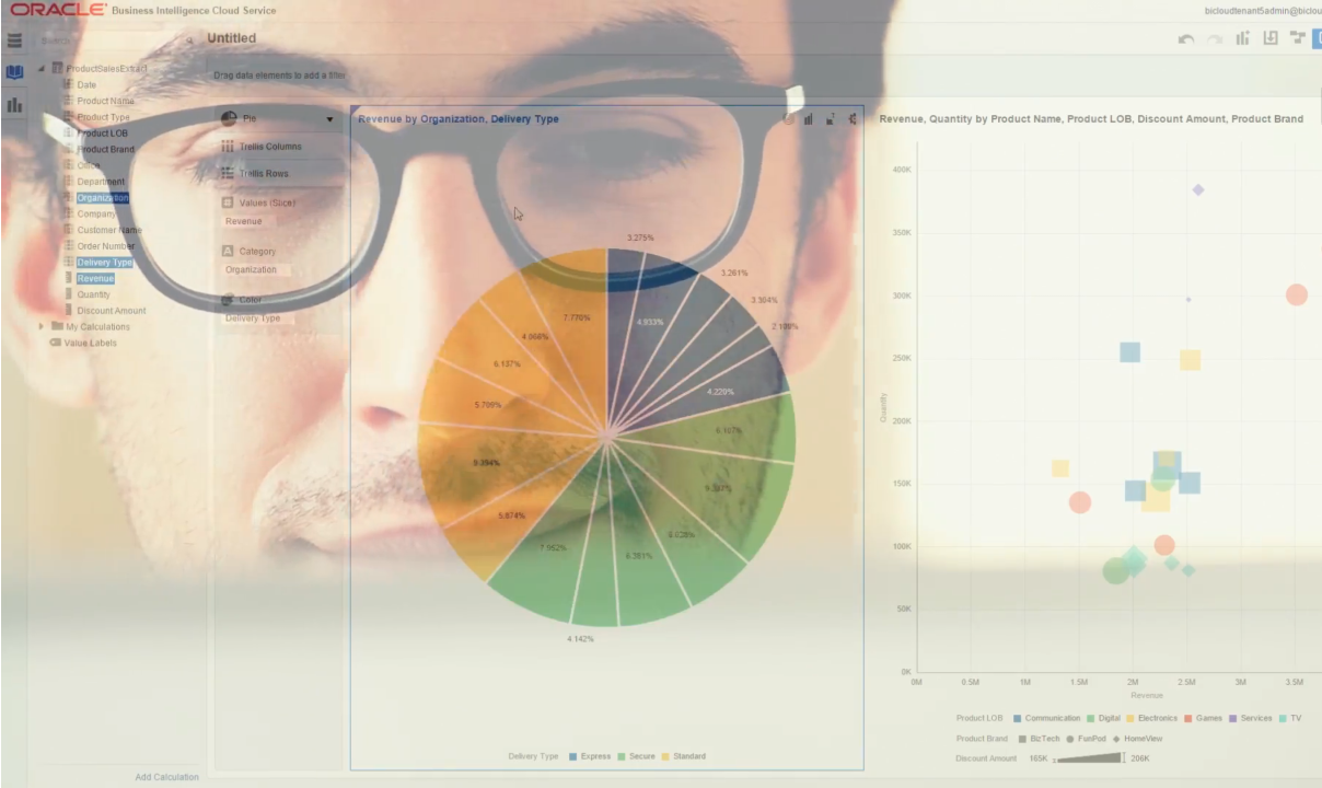
Visual Analyzer is available in Oracle BI products such as Oracle Business Intelligence Cloud Service (BICS) and Oracle Business Intelligence Enterprise Edition (OBIEE) 12c, or you can get the web-based Visual Analyzer separately. With Visual Analyzer, anyone on your team can easily create data visualizations to enhance their data interpretation.
The tool allows for individual exploration and discovery rather than the extended collaborative process of constructing views from data in the larger context of BICS and OBIEE. Visual Analyzer provides self-service analysis, transitioning users through data staging, analysis, composition, and consumption. Users no longer need a degree in design to create information-rich, compelling graphics. Just upload your data sets directly.
The intuitive interface gives users the freedom to explore and see their data from different perspectives. Having the ability to quickly visualize information allows for instant analysis and simplified reporting for your finance and operations team that’s not only easy to digest, but accurate down to the penny.
Learn more about creating effective visualizations in Best Practices in Data Visualization: How to Design Effective Dashboards That People Actually Use.